
ACT Basics#
Overview#
The ARM TRACER campaign collected a lot of very interesting data in Houston, TX from October 1, 2021 to September 30, 2022. One event that stands out is a dust event that occurred from July 16 to July 19, 2022. This notebook will give an introduction to basic features in ACT, using some relevant datastreams from this event
Intro to ACT
Downloading and Reading in Data
Quality Controlling Data
Aerosol Instrument Overview
Visualizing Data
Additional Features in ACT
Prerequisites#
This notebook will rely heavily on Python and the Atmospheric data Community Toolkit (ACT). Don’t worry if you don’t have experience with either, this notebook will walk you though what you need to know.
You will also need an account and token to download data using the ARM Live webservice. Navigate to the webservice information page and log in to get your token. Your account username will be your ARM username.
Concepts |
Importance |
Notes |
|---|---|---|
Helpful |
Time to learn: 60 Minutes
System requirements:
Python 3.11 or latest
ACT v1.5.0 or latest
numpy
xarray
matplotlib
Intro to ACT#
The Atmospheric data Community Toolkit (ACT) is an open-source Python toolkit for exploring and analyzing atmospheric time-series datasets. Examples can be found in the ACT Example Gallery. The toolkit has modules for many different parts of the scientific process, including:
Data Discovery (act.discovery)#The discovery module houses functions to download or access data from different groups. Currently it includes function to get data for ARM, NOAA, EPA, NEON, and more! Input/Output (act.io)#io contains functions for reading and writing data from various sources and formats. Visualization (act.plotting)#plotting contains various routines, built on matplotlib, to help visualize and explore data. These include
Corrections (act.corrections)#corrections apply different corrections to data based on need. A majority of the existing corrections are for lidar data. Quality Control (act.qc)#The qc module has a lot of functions for working with quality control information, apply new tests, or filtering data based on existing tests. We will explore some of that functionality in this notebook. Retrievals (act.retrievals)#There are many cases in which some additional calculations are necessary to get more value from the instrument data. The retrievals module houses some functions for performing these advanced calculations. Utilities (act.utils)#The utils module has a lot of general utilities to help with the data. Some of these include adding in a solar variable to indicate day/night (useful in filtering data), unit conversions, decoding WMO weather codes, performing weighted averaging, etc… |
|
Imports#
Let’s get started with some data! But first, we need to import some libraries.
import act
import numpy as np
import xarray as xr
import matplotlib.pyplot as plt
Downloading and Reading ARM’s NetCDF Data#
ARM’s standard file format is NetCDF (network Common Data Form) which makes it very easy to work with in Python! ARM data are available through a data portal called Data Discovery or through a webservice. If you didn’t get your username and token earlier, please go back and see the Prerequisites!
Let’s download some of the MPL data first but let’s just start with one day.
# Set your username and token here!
username = 'YourUserName'
token = 'YourToken'

# Set the datastream and start/enddates
datastream = 'hou30smplcmask1zwangM1.c1'
startdate = '2022-07-16'
enddate = '2022-07-16'

# Use ACT to easily download the data.  Watch for the data citation!  Show some support
# for ARM's instrument experts and cite their data if you use it in a publication
result = act.discovery.download_arm_data(username, token, datastream, startdate, enddate)
# Let's read in the data using ACT and check out the data
ds_mpl = act.io.arm.read_arm_netcdf(result)

ds_mpl
ds_mpl['cloud_base'].plot()
Quality Controlling Data#
ARM has multiple methods that it uses to communicate data quality information out to the users. One of these methods is through “embedded QC” variables. These are variables within the file that have information on automated tests that have been applied. Many times, they include Min, Max, and Delta tests but as is the case with the AOS instruments, there can be more complicated tests that are applied.
The results from all these different tests are stored in a single variable using bit-packed QC. We won’t get into the full details here, but it’s a way to communicate the results of multiple tests in a single integer value by utilizing binary and bits! You can learn more about bit-packed QC here but ACT also has many of the tools for working with ARM QC.
Other Sources of Quality Control#
ARM also communicates problems with the data quality through Data Quality Reports (DQR). These reports are normally submitted by the instrument mentor when there’s been a problem with the instrument. The categories include:
Data Quality Report Categories
Missing: Data are not available or set to -9999
Suspect: The data are not fully incorrect but there are problems that increases the uncertainty of the values. Data should be used with caution.
Bad: The data are incorrect and should not be used.
Note: Data notes are a way to communicate information that would be useful to the end user but does not rise to the level of suspect or bad data
Examples of ACT QC functionality
Additionally, data quality information can be found in the Instrument Handbooks, which are included on most instrument pages. Here is an example of the MPL handbook.
# Let's take a look at the quality control information associated with a variable from the MPL
variable = 'linear_depol_ratio'

# First, for many of the ACT QC features, we need to get the dataset more to CF standard and that
# involves cleaning up some of the attributes and ways that ARM has historically handled QC
ds_mpl.clean.cleanup()

# Next, let's take a look at visualizing the quality control information
# Create a plotting display object with 2 plots
display = act.plotting.TimeSeriesDisplay(ds_mpl, figsize=(15, 10), subplot_shape=(2,))

# Plot up the variable in the first plot
display.plot(variable, subplot_index=(0,), cb_friendly=True)

# Plot up a day/night background
display.day_night_background(subplot_index=(0,))

# Plot up the QC variable in the second plot
display.qc_flag_block_plot(variable, subplot_index=(1,))
plt.show()
Filtering data#
It’s easy to filter out data failing tests with ACT. This will show you how to filter data by test or by assessment.
# Let's filter out test 5 using ACT.  Yes, it's that simple!
ds_mpl.qcfilter.datafilter(variable, rm_tests=[1, 2], del_qc_var=False)

# There are other ways we can filter data out as well.  Using the
# rm_assessments will filter out by all Bad/Suspect tests that are failing
# ds.qcfilter.datafilter(variable, rm_assessments=['Bad', 'Suspect'], del_qc_var=False)

# Let's check out the attributes of the variable
# Whenever data are filtered out using the datafilter function
# a comment will be added to the variable history for provenance purposes
print(ds_mpl[variable].attrs)

# And plot it all again!
# Create a plotting display object with 2 plots
display = act.plotting.TimeSeriesDisplay(ds_mpl, figsize=(15, 10), subplot_shape=(2,))

# Plot up the variable in the first plot
display.plot(variable, subplot_index=(0,), cb_friendly=True)

# Plot up a day/night background
display.day_night_background(subplot_index=(0,))

# Plot up the QC variable in the second plot
display.qc_flag_block_plot(variable, subplot_index=(1,))
plt.show()
ARM Data Quality Reports (DQR)!#
ARM’s DQRs can be easily pulled in and added to the QC variables using ACT. We can do that with the below one line command. However, for this case, there won’t be any DQRs on the data but let’s visualize it just in case! Check out the ACT QC Examples for more use cases!
# Query the ARM DQR Webservice
ds_mpl = act.qc.add_dqr_to_qc(ds_mpl, variable=variable)

ds_mpl['qc_' + variable]
Aerosol Instrument Overview#
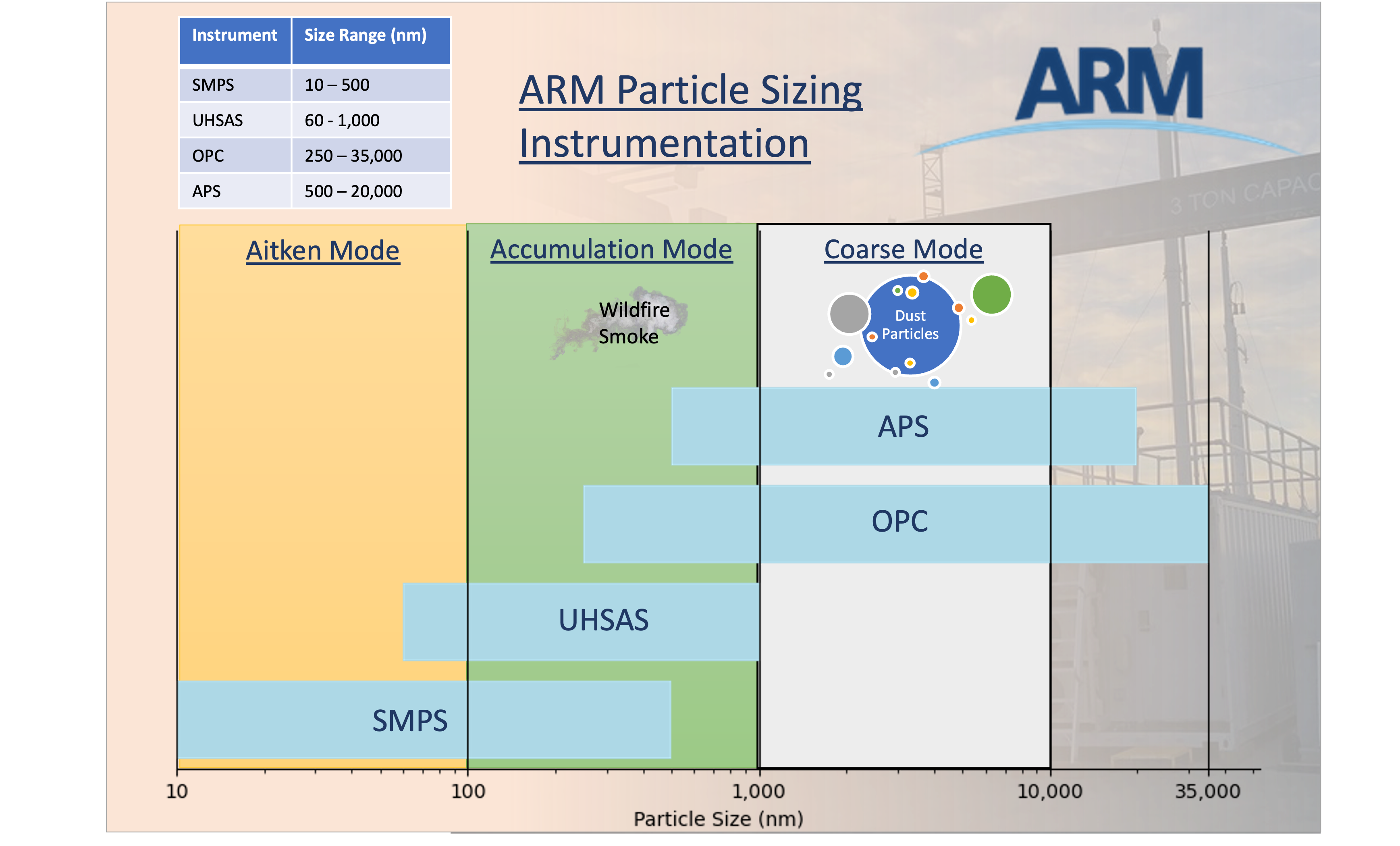
Single Particle Soot Photometer (SP2)#The single-particle soot photometer (SP2) measures the soot (black carbon) mass of individual aerosol particles by laser-induced incandescence down to concentrations as low as ng/m^3. Learn more Aerodynamic Particle Sizer (APS)#The aerodynamic particle sizer (APS) is a particle size spectrometer that measures both the particle aerodynamic diameter based on particle time of flight and optical diameter based on scattered light intensity. The APS provides the number size distribution for particles with aerodynamic diameters from 0.5 to 20 micrometers and with optical diameters from 0.3 to 20 micrometers. Learn more Aerosol Chemical Speciation Monitor (ACSM)#The aerosol chemical speciation monitor is a thermal vaporization, electron impact, ionization mass spectrometer that measures bulk chemical composition of the rapidly evaporating component of sub-micron aerosol particles in real time. Standard measurements include mass concentrations of organics, sulfate, nitrate, ammonium, and chloride. Learn more |
|
Downloading and QCing the Aerosol Data#
Let’s start pulling these data together into the same plots so we can see what’s going on.
# Let's set a longer time period
startdate = '2022-07-10'
enddate = '2022-07-20'

# APS
datastream = 'houaosapsM1.b1'
result = act.discovery.download_arm_data(username, token, datastream, startdate, enddate)
ds_aps = act.io.arm.read_arm_netcdf(result)

#ACSM
datastream = 'houaosacsmM1.b2'
result = act.discovery.download_arm_data(username, token, datastream, startdate, enddate)
ds_acsm = act.io.arm.read_arm_netcdf(result)

#SP2
datastream = 'houaossp2bc60sM1.b1'
result = act.discovery.download_arm_data(username, token, datastream, startdate, enddate)
ds_sp2 = act.io.arm.read_arm_netcdf(result)

# AOSMET - Just to get the wind data!
datastream = 'houmetM1.b1'
result = act.discovery.download_arm_data(username, token, datastream, startdate, enddate)
ds_met = act.io.arm.read_arm_netcdf(result)

# MPL to get the full record
datastream = 'hou30smplcmask1zwangM1.c1'
result = act.discovery.download_arm_data(username, token, datastream, startdate, enddate)
ds_mpl = act.io.arm.read_arm_netcdf(result)
# Before we proceed to plotting, let's reduce the MPL data down a little bit
# This will remove all data where heights are greater than 5
ds_mpl = ds_mpl.where(ds_mpl.height <= 3, drop=True)

# This will resample to 1 minute
ds_mpl = ds_mpl.resample(time='1min').nearest()
# Let's not forget about QCing the data!
# We can remove all the bad data from each aerosol dataset
ds_aps.clean.cleanup()
ds_aps = act.qc.arm.add_dqr_to_qc(ds_aps)
ds_aps.qcfilter.datafilter(rm_assessments=['Bad'], del_qc_var=False)

ds_acsm.clean.cleanup()
ds_acsm = act.qc.arm.add_dqr_to_qc(ds_acsm)
ds_acsm.qcfilter.datafilter(rm_assessments=['Bad'], del_qc_var=False)

ds_sp2.clean.cleanup()
ds_sp2 = act.qc.arm.add_dqr_to_qc(ds_sp2)
ds_sp2.qcfilter.datafilter(rm_assessments=['Bad'], del_qc_var=False)

ds_mpl.clean.cleanup()
ds_mpl = act.qc.arm.add_dqr_to_qc(ds_mpl)
ds_mpl.qcfilter.datafilter(rm_assessments=['Bad'], del_qc_var=False)
Visualizing Data#
We have all the datasets downloaded, let’s start to visualize them in different ways using ACT. If you ever need a place to start with how to visualize data using ACT, check out the ACT Plotting Examples
# We can pass a dictionary to the display objects with multiple datasets
# So let's plot all this up!
display = act.plotting.TimeSeriesDisplay({'aps': ds_aps, 'mpl': ds_mpl, 'acsm': ds_acsm, 'sp2': ds_sp2},
                                         subplot_shape=(4,), figsize=(10,18))

# MPL Plot
# Variable names of interest linear_depol_ratio, linear_depol_snr, backscatter_snr
display.plot('linear_depol_ratio', dsname='mpl', subplot_index=(0,), cb_friendly=True)
display.set_yrng([0, 3], subplot_index=(0,))

# APS Plot
display.plot('total_N_conc', dsname='aps', subplot_index=(1,))
display.day_night_background(dsname='aps', subplot_index=(1,))

# ACSM plot
display.plot('sulfate', dsname='acsm', subplot_index=(2,), label='sulfate')
display.plot('nitrate', dsname='acsm', subplot_index=(2,), label='nitrate')
display.plot('ammonium', dsname='acsm', subplot_index=(2,), label='ammonium')
display.plot('chloride', dsname='acsm', subplot_index=(2,), label='chloride')
display.plot('total_organics', dsname='acsm', subplot_index=(2,), label='total_organics')

display.day_night_background(dsname='acsm', subplot_index=(2,))

# SP2 Plot
display.plot('sp2_rbc_conc', dsname='sp2', subplot_index=(3,))
display.day_night_background(dsname='sp2', subplot_index=(3,))

plt.subplots_adjust(hspace=0.3)
plt.legend()
plt.savefig('./images/output.png')
plt.show()
Data Rose Plots#
These plots display the data on a windrose-like plot to visualize directional dependencies in the data.
# We already should have the data loaded up so let's explore with some data roses
# First we need to combine data and to do that, we need to get it on the same time grid
ds_combined = xr.merge([ds_met.resample(time='30min').nearest(), ds_acsm.resample(time='30min').nearest()], compat='override')

# Plot out the data rose using the WindRose display object
display = act.plotting.WindRoseDisplay(ds_combined)
display.plot_data('wdir_vec_mean', 'wspd_vec_mean', 'sulfate', num_dirs=15, plot_type='line', line_plot_calc='mean')
plt.show()
# First we need to combine data and to do that, we need to get it on the same time grid
ds_combined = xr.merge([ds_met.resample(time='1min').nearest(), ds_sp2.resample(time='1min').nearest()], compat='override')

# Plot out the data rose using the WindRose display object
display = act.plotting.WindRoseDisplay(ds_combined)

# Let's try a different type of data rose that will show the mean Black Carbon Concentration
# depending on wind direction and speed
display.plot_data('wdir_vec_mean', 'wspd_vec_mean', 'sp2_rbc_conc', num_dirs=15, plot_type='contour', contour_type='mean')
plt.show()
Checkout the area#
The AMF was deployed at La Porte Municipal Airport. Check out the google map and see if this mapes sense!
Back to the visualizations!#
Let’s get back to checking out the other visualization features in ACT!
Histograms#
# We do the same thing as before but call the DistributionDisplay class
display = act.plotting.DistributionDisplay(ds_aps)

# And then we can plot the data!  Note that we are passing a range into the
# histogram function to set the min/max range of the data
display.plot_stacked_bar('total_N_conc', bins=20, hist_kwargs={'range': [0, 60]})
plt.show()
# We can create these plots in groups as well but we need to know
# how many there will be ahead of time for the shape
display = act.plotting.DistributionDisplay(ds_aps, figsize=(15, 15), subplot_shape=(6, 4))
groupby = display.group_by('hour')

# And then we can plot the data in groups!  The main issue is that it doesn't automatically
# Annotate the group on the plot.  We're also setting the titile to blank to save space
groupby.plot_group('plot_stacked_bar', None, field='total_N_conc', set_title='', bins=20, hist_kwargs={'range': [0, 60]})

# We want these graphs to have the same axes, so we can easily run through
# each plot and modify the axes.  Right now, we can just hard code these in
for i in range(len(display.axes)):
    for j in range(len(display.axes[i])):
        display.axes[i, j].set_xlim([0, 60])
        display.axes[i, j].set_ylim([0, 15000])

plt.subplots_adjust(wspace=0.35)

plt.show()
Scatter Plots and Heatmaps#
Let’s plot up a comparison of the APS total concentration and the ACSM sulfates. Feel free to change the variables from the ACSM to experiment!
# Let's merge the aps and ACSM data together and plot out some distribution plots
# First we need to combine data and to do that, we need to get it on the same time grid
ds_combined = xr.merge([ds_aps.resample(time='30min').nearest(), ds_acsm.resample(time='30min').nearest()], compat='override')

# Plot out the data rose using the Distribution display object
display = act.plotting.DistributionDisplay(ds_combined)
display.plot_scatter('total_N_conc', 'sulfate', m_field='time')

plt.show()
# Let's try a heatmap with this as well!
display = act.plotting.DistributionDisplay(ds_combined, figsize=(12, 5), subplot_shape=(1, 2))

display.plot_scatter('total_N_conc', 'sulfate', m_field='time', subplot_index=(0, 0))
display.plot_heatmap('total_N_conc', 'sulfate', subplot_index=(0, 1), x_bins=50, y_bins=50, threshold=0)

plt.show()
# Let's try one last plot type with this dataset
# Violin plots!
display = act.plotting.DistributionDisplay(ds_acsm)

# And then we can plot the data!
display.plot_violin('sulfate', positions=[1.0])
display.plot_violin('nitrate', positions=[2.0])
display.plot_violin('ammonium', positions=[3.0])
display.plot_violin('chloride', positions=[4.0])
display.plot_violin('total_organics', positions=[5.0])

# Let's add some more information to the plots
# Update the tick information
display.axes[0].set_xticks([0.5, 1, 2, 3, 4, 5, 5.5])
display.axes[0].set_xticklabels(['',
                                 'Sulfate',
                                 'Nitrate',
                                 'Ammonium',
                                 'Chloride',
                                 'Total Organics',
                                 '']
                                )

plt.show()
Additional Features in ACT#
If there’s time to explore more features or if you want to on your own time, these are some of the many additional features that you might find useful in ACT
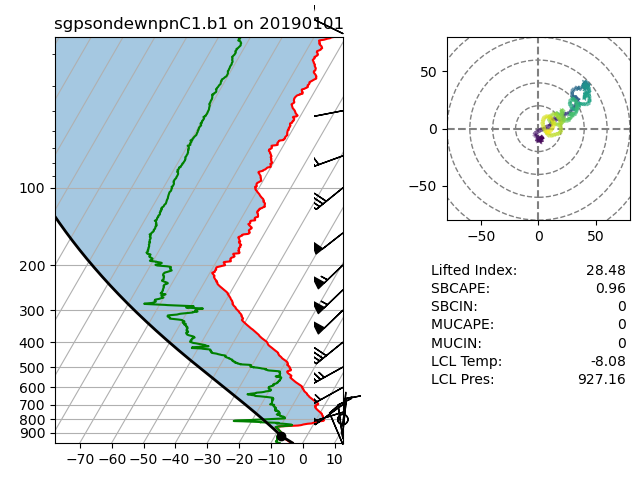
Skew-T Plots#
# Let's set a longer time period
startdate = '2022-07-16'
enddate = '2022-07-16'

# SONDE
datastream = 'housondewnpnM1.b1'
result = act.discovery.download_arm_data(username, token, datastream, startdate, enddate)
result.sort()
ds_sonde = act.io.arm.read_arm_netcdf(result[-1])

# Plot enhanced Skew-T plot
display = act.plotting.SkewTDisplay(ds_sonde)
display.plot_enhanced_skewt(color_field='alt')

plt.show()
Wind Roses#
# Now we can plot up a wind rose of that entire month's worth of data
windrose = act.plotting.WindRoseDisplay(ds_met, figsize=(10,8))
windrose.plot('wdir_vec_mean', 'wspd_vec_mean', spd_bins=np.linspace(0, 10, 5))
windrose.axes[0].legend()
plt.show()
Present Weather Codes#
See this example of how to plot up these present weather codes on your plots!
# Pass it to the function to decode it along with the variable name
ds_met = act.utils.inst_utils.decode_present_weather(ds_met, variable='pwd_pw_code_inst')

# We're going to print out the first 10 decoded values that weren't 0
# This shows the utility of also being able to use the built-in xarray
# features like where!
print(list(ds_met['pwd_pw_code_inst_decoded'].where(ds_met.pwd_pw_code_inst.compute() > 0, drop=True).values[0:10]))
Accumulating Precipitation#
This example shows how to accumulate precipitation using the ACT utility and then overplot the PWD present weather codes
# Let's accumulate the precipitation data from the three different sensors in the MET System
# These instruments include a tipping bucket rain gauge, optical rain gauge, and a present weather detector
variables = ['tbrg_precip_total', 'org_precip_rate_mean', 'pwd_precip_rate_mean_1min']
for v in variables:
    ds_met = act.utils.data_utils.accumulate_precip(ds_met, v)

# We can plot them out easily in a loop.  Note, they have _accumulated on the end of the name
display = act.plotting.TimeSeriesDisplay(ds_met, figsize=(8, 6))
for v in variables:
    display.plot(v + '_accumulated', label=v)

# Add a day/night background
display.day_night_background()

# Now we can decode the present weather codes (WMO codes)
ds_met = act.utils.inst_utils.decode_present_weather(ds_met, variable='pwd_pw_code_1hr')

# We're only going to plot up the code when it changes
# and if we plot it up, we will skip 2 hours so the plot
# is not busy and unreadable
ct = 0
ds = ds_met.where(ds_met.pwd_pw_code_1hr.compute() > 0, drop=True)
wx = ds['pwd_pw_code_1hr_decoded'].values
prev_wx = None
while ct < len(wx):
    if wx[ct] != prev_wx:
        # We can access the figure and axes through the display object
        display.axes[0].text(ds['time'].values[ct], -7.5, wx[ct], rotation=90, va='top')
    prev_wx = wx[ct]
    ct += 120
plt.subplots_adjust(bottom=0.20)
plt.legend()
plt.show()
Doppler Lidar Wind Retrievals#
This will show you how you can process the doppler lidar PPI scans to produce wind profiles based on Newsom et al 2016.
# We're going to use some test data that already exists within ACT
# Let's set a longer time period
startdate = '2022-07-16T21:00:00'
enddate = '2022-07-16T22:00:00'

# SONDE
datastream = 'houdlppiM1.b1'
result = act.discovery.download_arm_data(username, token, datastream, startdate, enddate)
result.sort()


ds = act.io.arm.read_arm_netcdf(result)
ds
# Returns the wind retrieval information in a new object by default
# Note that the default snr_threshold of 0.008 was too high for the first profile
# Reducing it to 0.002 makes it show up but the quality of the data is likely suspect.
ds_wind = act.retrievals.compute_winds_from_ppi(ds, snr_threshold=0.0001)

# Plot it up
display = act.plotting.TimeSeriesDisplay(ds_wind)
display.plot_barbs_from_spd_dir('wind_speed', 'wind_direction', invert_y_axis=False)

#Update the x-limits to make sure both wind profiles are shown
display.axes[0].set_xlim([np.datetime64('2022-07-16T20:45:00'), np.datetime64('2022-07-16T22:15:00')])

plt.show()
Mimic ARM Data Files#
ARM’s NetCDF files are based around what we call a data object definition or DOD. These DOD’s essentially create the structure of the file and are what you see in the NetCDF file as the header. We can use this information to create an xarray object, filled with missing value, that one can populated with data and then write it out to a NetCDF file that looks exactly like an ARM file.
The user is able to set up the size of the datasets ahead of time by passing in the dimension sizes as shown below with {'time': 1440}
This could greatly streamline and improve the usability of PI-submitted datasets.
Note, that this does take some time for datastreams like the MET that have a lot of versions.
ds = act.io.arm.create_ds_from_arm_dod('ld.b1', {'time': 1440}, scalar_fill_dim='time')

# Create some random data and set it to the variable in the obect like normal
ds['precip_rate'].values = np.random.rand(1440)
ds
ds['precip_rate'].plot()